Content on this page adapted from Poster Presentations research guide by Bethany Myers for UCLA Libraries, under the Creative Commons Attribution 4.0 License.
You can create posters using PowerPoint (Microsoft Office) or Google Slides, both readily available on campus. Visit the Library and IT pages for locations of Lab Software: https://www.southwestern.edu/library-and-it/infodesk/computing-and-software/.
Posters can be horizontal or vertical in orientation. The title/author(s) will be across the top with areas below that contain the rest of the poster elements. Make sure you leave plenty of white space in your design—a poster crammed full of text and images is very difficult to read.
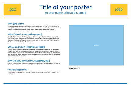
Here is an example of a 2 column poster layout using the 5 Ws for headings (who, what, where, when, and why):

Use the links below to download this PowerPoint template and other similar templates in two sizes: 24"x36" and 36"x48". These templates include a variety of placeholder elements for photos and figures. You can also find or create your own templates online.
